When it comes to website design, you have two main areas: Above the fold and below the fold.
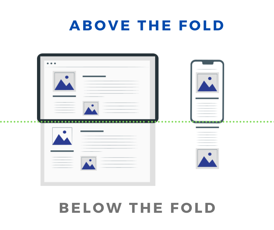
Above the fold means that your main content is visible without having to scroll down. This is usually the default position for most websites. Below the fold means that your content is hidden until someone scrolls down to see it. This is the position of many small-to-medium-sized websites.
There are a few things to consider when choosing which option to go with as a web designer:
- How important is visibility?
- What is the page’s essential elements and important information
- Will your audience be using different devices
- How much scrolling will be involved?
- What are your goals for your website?
The main thing to remember is that there’s no one right answer, and it depends on the specific situation and goals of your website. To help you decide what the best website design approach is for your site we have written this blog post to provide you with everything you need to know when considering above the fold vs below the fold.
Let’s start by taking a look at what the two terms came from.
Table of Contents
History: Where does below the fold and above the fold come from?
In the early days of publishing, and before the majority of the content produced found its way to digital platforms, above the page fold was a term that was used to describe the content that was on the first half of a newspaper and clearly displayed on newsstands.
The top half that was visible contained the major headlines and lead stories for the day. Usually filled with catchy headlines and elaborate imagery that was used to attract readers’ attention and get them interested in buying the paper. The above the fold content was there to entice and prime the passerby into taking an action: To buy the paper.
Even after the 1990s when there was a transition to online content and website design the term stuck. However, the fold is no longer talking about the physical fold in the paper, but actually the bottom of the browser page. Technically speaking, this is approximately 600 pixels from the top of the browser page.
So what exactly does above the fold mean? Let’s take a look at the ins and outs of above the fold in the next section.
What does above the fold mean?
Above the fold content is content that fits into the portion of a web page shown to a visitor before any scrolling takes place. Thus, any content that you need to scroll down to see, would be content that is located ‘below the fold’. In other words, the ‘fold’ is where the browser window ends on your screen, even though the content continues below it.
Above the fold contains valuable real estate for your website design. This is because it is the first thing people see when they land on your website. If the above the fold content is not well designed, is not descriptive, is difficult to understand, or looks spammy, people are unlikely to stick around to see what’s below the fold.
There are a few things you can do to make sure your content above the fold is interesting and capturing the interest of your website viewers:
- Make your text short and easy to read
- Use clear and concise language
- Place your main points at the top of the page so they’re easily seen
- Try to avoid complex images and graphics, as these may distract the reader or slow down page loading time
In the next section we discuss where the above the fold stops and where the below the fold begins for different screen sizes:
Above the fold dimensions:
It is difficult to define a single fold measurement or placement for a website. It is difficult to determine the size because of the variety of monitor sizes (for both desktops and laptops), screen resolutions, browser plugins and even the different phone and tablet screens that people use to browse the internet.
Even though there are various screen sizes, if we take an average fold placement, the majority of web designs define the fold line around 1,000 pixels wide and 600 pixels in height.
The dimensions above are an average and are thought to be the best size for the most commonly used monitor/browser combination of 1024×786 pixels. However, even this size could fluctuate if the user doesn’t have the browser window maximized, or if they have other toolbars that may make the view window even smaller.
By utilizing a website’s analytics program, you can get a good idea on what is the most common screen your visitors are using when they visit your online business. While 1024×768 has traditionally been considered the most common screen size, new dimensions are rising in popularity such as 320×568 and 360×640.
Different fold locations and screen sizes for popular devices
With the mass adoption of mobile devices to browse the internet, the addition of various screen sizes continues to multiply. With different screen sizes, comes different fold sizes as well. This is important to consider while designing your website.
Even though responsive website design is able to assist in making a website look good on any screen size, it is still important to design your website in a smart way, to allow for seamless design changes and shifts, fast load speeds, and usability stays high.
To ensure that your content is displayed correctly above the fold, we have compiled some of the most common breakpoints for screen sizes. Knowing these breakpoints will help webmasters when testing website designs and identifying how content will be displayed.
Mobile screens: Standard website resolutions
- 360×640
- 375×667
- 414×896
- 360×780
- 375×812
Table screens: Standard website resolutions
- 768×1024
- 1280×800
- 800×128
- 601×962
- 962×601
Laptop screens: Standard website resolutions
- 1920×1080
- 1366×768
- 1440×900
- 1536×864
- 1024×768
Why is above the fold important?
For content marketing the design, layout and placement of content above the fold is essential to keeping visitors on your website. Whereas, the above the fold content is the very first thing that they see after arriving on your website. If they don’t find it valuable, you may find yourself with a high bounce rate. However, if utilized properly, this can be prime real estate in gaining visitors attention and retaining them on your website.
As the content in this prime real estate will have high visibility, make sure that you are placing the most important content for achieving your business goals there. Ensure that in a split second you can grab the visitor’s attention and present them with content that is valuable to them. Always make sure to develop content for your visitor first. It should provide value, be concise and be exactly what they are looking for on that particular page.
Above the fold can also be a great place to optimize for ads. Ads above the fold will have increased visibility and generate more ad revenue because of it. For business to business (B2B) websites, call to action (CTAs) buttons or other essential information about the product or service you are offering above the fold can result in increased conversions and less bounce rates for your homepage or other landing pages.
Above the fold for mobile devices
As mobile devices continue to rise in popularity for web browsing, it is crucial that you consider this when optimizing your above the fold web design for mobile devices.
The tough thing is, mobile devices have a wide variety of screen sizes and they are only getting more vast. One thing you can be fairly confident about though, is that when an individual uses a mobile device to search your page, they are more likely to use portrait mode rather than in landscape mode. Portrait mode however will end up turning your traditional page design sideways.
As mobile device users continue to grow, the best way to stay proactive with your website design and to maximize the above the fold content, is to use responsive website design. Responsive website design utilizes flexible layouts, images and cascading style sheets in its design to allow for it to adapt to different screen sizes. Therefore, in responsive design, there is no fixed layout for a page, and they will react or “respond” to the environment in which they are consumed.
Even though the most essential content should always be placed above the fold and as high on the page as possible, it is still important to design pages in a manner that encourages scrolling. This way no matter where your content is, if you can get a visitor to scroll through your website, they will see it.
SEO considerations: Above the fold
Although it may be a good idea to utilize the real estate above the fold for placing ads in order to increase their visibility, it may end up backfiring if you go overboard with all the ads. Consider this: if every time you went to a site, or a new page, you were prompted with an ad, would you consider that valuable? Sites that place too many ads at the top of the page usually have a bad user experience, and at times, resulting in a significant reduction in free organic traffic.
Google is constantly releasing algorithm updates that change the way search engine optimization (SEO) and rankings are affected. Moreover, the updates also release updates that penalize websites that place too many ads above the fold.
When working to optimize ad visibility, remember to aim for a nice balance. The balance should be between ad visibility and user experience.
Optimizing content & ad placement above the fold
It will take multiple iterations to optimize the placement of ads and content on your website. In order to maximize the benefits, you should have data driven decisions, that you can test and experiment with, to understand how your website traffic responds.
In order to do this, you can check out your analytics program and investigate the demographics of your visitors according to their: browsers, screen sizes, and device type. While doing this, make sure to analyze the user behavior as well on your page: scroll depth, bounce rate, engagement rate.
By conducting an in depth analysis of your page and its visitors, you can begin to understand their behaviors, in order to build a baseline metric. This baseline metric should be used as a starting point to test multiple ideas and features, with the goal to maximize user interactions on your website.
After you conduct a site audit, you can begin to develop a strategy to move forward. Through A/B testing you can try to implement various features and elements to maximize your content and ad placements above the fold.
After completing the first iteration. Head back to your analytics page and start the process again. The goal here is not to make huge leaps, but to take small calculated steps to make your website better.
Let’s take a look at important elements to include above the fold.
What is above the fold optimization?
Above the fold optimization is a critical aspect of web design and user experience. This area of a webpage is what a user sees first when they arrive on a site, before they have a chance to scroll down. As such, it’s important to make the most of this real estate and create a strong first impression.
To optimize the above the fold area, you should focus on the most important elements of your content, such as your value proposition or key messages. This might include attention-grabbing headlines, clear calls to action, or visually appealing images that draw the user’s eye.
It’s also important to ensure that the above the fold area is well-organized and easy to navigate, with a clear hierarchy of information that guides the user through the page.
By optimizing the above the fold area, you can improve user engagement and encourage visitors to explore more of your site, ultimately leading to better conversions and more satisfied users.
Content to include above the fold
Above the fold content is the most visible content on a website, and it’s typically what first catches someone’s attention. This means that it should be both interesting and informative, so people will want to read it.
Therefore, it is important that you include website elements that will keep your website traffic on your site, as well as help them along the buyers path. Below we have listed five elements that will keep your website traffic interested, well informed about your online business, as well as increase your conversion rates.
Let’s take a look at five things to include above the fold:
1. Your brand logo
Your brand logo should be prominently displayed above the fold on all your pages. It should be large and easy to see, and it should be professionally designed. This will help with brand credibility and to ensure trust with the website visitor.
2. Unique selling proposition (USP)
The USP of your company should be prominently displayed on each page, preferably in a sentence or two. This is what sets you apart from the competition and what makes you unique.
The unique selling proposition of your company will encourage excitement as well as interest in the company with the visitors. Additionally, it will describe exactly what the website and business is about, and help people decide if it is the right place for them.
3. Simple intuitive navigation
Simple, intuitive navigation is key in order to make sure that your customers can find what they’re looking for as quickly as possible. Make sure that all your menus and internal links are easy to understand and use. This will help lower your bounce rate and keep site visitors on your page for longer durations.
4. Contact information
Contact information should be easily accessible so that customers can reach you directly if they have any questions or concerns about your products or services. Moreover, contact information should be clickable buttons and hyperlinks that allow for users to directly contact you with one click. By using buttons and hyperlinks on your contact information you will be able to significantly increase your conversion rate.
5. Call to action
Finally, always make sure to include a call to action somewhere on each page – this will help encourage visitors to take action and buy whatever it is that you’re selling. The call to action should be clearly communicated and easy to follow, so that visitors can quickly and easily take action on what they’ve read
Does Google give preference to content above the fold?
Historically, Google gave higher preference to content that was included above the fold. Whereas, the content and keywords were considered to be of higher value because they were prominently displayed. However, as Google’s algorithm and AI have gotten smarter and now values content throughout the web page the same.
To elaborate further on how Google views content above the fold, Google’s Mueller answered whether Google had a preference:
“I don’t think we have strong preferences in that regard.”
Google’s search advocate John Mueller
Mueller went on to elaborate his statement by saying:
“So the main thing is that we want to see some content above the fold.
Which means… a part of your page should be visible when a user goes there.
So for example if a user goes to your website and they just see a big holiday photo and they have to scroll down a little bit to actually get content about a hotel, then that would be problematic for us.
But if they go to your home page and they see a hall of fame photo on top and also a little bit of information about the hotel, for example for a hotel site, that would be fine.
So it’s not purely that the content has to be above the fold. But… some of the content has to be.”
Google’s search advocate John Mueller
To listen to everything Mueller had to say about how Google views content above the fold and on websites in general, have a look at the youtube video below.
Now that we have discussed the importance of above the fold is, and how to best utilize it, it is important to discuss below the fold as well. In the next section we will discuss all the important factors of below the fold content.
Below the fold
What does below the fold mean?
Below the fold refers to the part of the webpage that a visitor must scroll to see and interact with. Usually, content below the fold is deemed to be less important than the content featured above the fold, as it takes some sort of action to see. It is a leftover term that plays homage to the physical print days, that has been modernized and contains all information that is placed below the bottom of the initial browser window, or usually, 600 pixels or more from the top of the page.
Typically below the fold content will be different than what is showcased above the fold. Whereas, the content below the fold serves a different job than what is above the fold, and that is why it is important to understand why below the fold is important.
How is below the fold measured: Below the fold dimensions
It is difficult to pinpoint the exact size of the initial fold and where the ‘below the fold’ section will be. This is because of the various screen sizes that individuals searching the web use. Moreover, the screen size, resolution, and even the browser will change the exact size of the fold.
Most web designers use the commonly agreed upon size of the fold which is roughly 1,000 pixels wide and 600 pixels tall.
The 1,000 pixels wide and 600 pixels tall estimate is for the most common browsers and monitors that are being used which have a browser size of 1024×786 pixels. Make sure to note that the browser window needs to be maximized, and the user needs to have no other toolbars or plugins installed to achieve this size of window.
Utilize your website analytics tool (like Google Analytics) to investigate the most common screen size that your traffic is using when visiting your website.
Why is below the fold important?
Depending on where the content is placed on the page, will determine how an individual interacts and engages with it. Whereas, if the content is below the fold, it will be hidden from the page visitor when the page initially loads for them. Thus, if the visitor leaves the page before scrolling at all, they will never see the content.
Data shows that the placement of ads and content will be significantly reduced if it is located below the fold. This is directly related to the fact that people will have to interact with the page in order to see that content.
A Google study has shown that advertisements that are placed above the fold result in 73% visibility. In contrast, ads that are placed below the fold had only 44% visibility. It is important to note that an ad that doesn’t have at least 50% of its pixels show up on a visitors screen for at least one second won’t be counted as a viewable impression.
Therefore, if you keep ads below the fold, it will significantly reduce its viewable impression, and thus, generating less ad revenue. Therefore, if you are selling ad space on your website, you might have to provide discounted prices for ads that appear below the fold because of the lower visibility.
Below the fold – Considerations for mobile
It has generally been accepted that the most common dimensions for the ‘above the fold’ section was 1024×768. However, in recent years there has been a surge in usage of mobile devices for website browsing. Thus, taking mobile usage into consideration most web designers also consider 320×568 and 360×640 while developing websites. However, the rise in additional devices for web browsing has only made things more difficult in terms of the fold. Whereas, mobiles and tablets have many different sizes to consider, which each have specific dimensions, requirements, and limitations.
One thing that provides a breath of fresh air though is that most people search the internet in portrait mode rather than landscape. Which will allow the website developer to plan accordingly with a certain level of confidence. However, this does mean that your website will be viewed sideways when compared to a computer. Don’t fret though. The best thing to do is plan ahead and ensure that you use a responsive website design that allows the website to react to whatever the viewing environment entails. Allowing for it to be viewed correctly on whatever device the visitor is using.
As always, the best practice is to make sure that the most important content is placed above the fold. However, you should keep in mind that you want to prime and prompt visitors to scroll through your entire page. By enticing visitors to scroll down the page, you can make sure that they are seeing all the content that you are developing, no matter the location of it.
Mobile users are more likely to scroll down your content than desktop users are. A sign of relief is that these scrolling practices have begun to carry over to desktop users as well. Whereas, pages are even being developed now to be infinite scrolling pages.
Tracking website usage: Above and below the fold
The placement of content has a major impact on if the content will be viewed and interacted with. Therefore, it is essential that you constantly monitor how your content is being interacted with, and test if a different placement will provide better results.
To monitor these key metrics, you can use Google Analytics. Google Analytics will provide you with invaluable information regarding the breakdown of users into what percentage is using desktop and what percentage is using mobile devices. Additionally, it will provide you with data regarding what is the average screen size of your user.
Another great tool to use is a heat map. Hotjar is a useful platform that can provide information about the scroll-depth (a metric that displays how far a visitor scrolled down your page) and where page visitors are clicking and interacting with your page.
As always, once you believe you have found a good combination of features, elements and placement of everything, you will want to conduct some A/B testing. By testing everything, you can get in depth data about it, and understand if it is actually working.
Develop an SEO objective and goal for every page, develop strategies, and test them. After you have figured out if they are working or not, circle back to the beginning and start again. By repeating this process, you can continue to refine your site and make small improvements every time.
FAQs: Above the fold vs below the fold
Below we have included some of the most frequently asked questions regarding above the fold vs below the fold.
Call to actions should be placed above the fold – where people can see them most easily – because this is where they are most likely to click.
If you want to increase the click through rate on your call to action, then you should make sure that it’s prominent and easy to spot. You can do this by positioning it in a spot that’s visible when users first visit your page, or by using a large font size for call to actions. You can also include pictures or other visual elements that help explain what the action is and why people should take it.
There are two main types of call to actions: above the fold and below the fold.
- Above the fold CTA’s are visible right away when you first visit a page, and they’re usually placed at the top or bottom of the page. They’re usually easy to spot, because they’re in large, bold letters
- Below the fold CTA’s are hidden until you click on them, and they’re usually located towards the bottom of a page. They’re generally less noticeable than above-the-fold CTA’s, because they’re smaller and in lower-case letters.
Which type of call to action is best for your website depends on a variety of factors, like how prominent you want your CTA to be and how much traffic you expect to generate. However, generally speaking, it’s better to have above-the-fold CTA’s than below-the-fold ones.
Yes, above the fold still matters as it is prime real estate for website design. This is because it is the first portion of the website that visitors, and the first opportunity to gain the interest of the website visitor.
The purpose of above the fold is twofold: first, it allows a visitor to see as much content on a page as possible in the least amount of time, which can increase your chances of making a purchase; and second, it gives advertisers more space to display their ads.
Though it may seem like above the fold content isn’t as important as it used to be, there’s actually evidence to suggest that it still plays an important role. A study found that nearly half of all website visitors open the homepage first and spend 30% more time on websites where the homepage is above the fold than on websites where it’s below the fold.
Furthermore, another study by Adobe showed that increased exposure to above-the-fold ads leads to increased click-through rates (CTRs), meaning that more people are clicking on ads than usual.
So while above the fold may not be as important anymore for SEO purposes, it’s still extremely important for website design purposes and increasing engagements and conversions.
Below the fold is the part of a website that’s hidden unless you scroll down. This is where most of the content is, and it can be less engaging than Above the fold. Some people believe that Below the fold doesn’t matter as much because people are more likely to abandon a website if they have to scroll too far down to find what they’re looking for.
Some argue that Above the fold content is more important because it establishes your credibility and trust with visitors from the start. It also helps you to create a better initial impression, which may influence how people view your website overall.
However, others believe that Below the fold content can still be beneficial because it can provide valuable insights for SEO (search engine optimization). This is because search engines are designed to look at all pages on a website, and Below the fold content often has more information about the site’s keywords and topics.
Yes, the H1 should be above the fold on your website. This is because it’s one of the most important elements of your website and you want people to see it as soon as possible. Not only does this increase inbox visibility, but it also gives visitors a better first impression of your website. Additionally, it can help you capture more leads and optimize your search engine ranking.
When you’re looking at a website or advertisement, the first thing that’s going to catch your eye is the above-the-fold (AF) section. This is the part of the page that’s usually visible before you have to scroll down.
The goal of an AF campaign is to get as much of this section visible as possible in order to capture attention and lead users down to other parts of the page where they can see more information. If you’re looking to increase your web traffic overall, then optimizing your above the fold content is a good way to start. However, keep in mind that there are other factors at play too – like SEO – so don’t neglect these aspects when trying to boost your website’s visibility
There are a few things you can do to optimize your above the fold content for visibility. Firstly, make sure that your content is well-written and easy to read. Secondly, make sure that it’s optimized for desktop viewing – users will see it first if it’s placed above the fold on their screen. Finally, make use of catchy headlines and other design elements that will draw in readers quickly.
- The layout of the page
- The color scheme
- The typeface used
- The thickness and positioning of the text
- The size and placement of graphics and images
Key takeaways: Above the fold vs below the fold
Above the fold and below the fold play a significant role in website design. Whereas, with the right design you can entice a website visitor to stay on your page and interact with your site. This is important as the longer you keep a potential customer on your site, the more successful you will be at converting them into a paying customer.
By understanding the different elements to include above the fold, as well as the supporting text you should keep below the fold for SEO purposes the more successful your online business will be.
To find out how to optimize your website further, or to get a whole new responsive design, you can contact us today. Clear Door SEO is an SEO company in Portland Oregon that provides website design services, as well as conversion optimization.