A call to action (CTA) is essential for helping you get your audience to perform a desired task. Whereas, it is important to help them through the entire buyers journey, or conversion process you are targeting.
By using best practices for CTAs you can increase your conversion rate and generate additional leads for your company.
What is a call to action on a website?
A call to action is a phrase or sentence that encourages people to take some kind of action. This could be anything from clicking on a link to filling out a form to making a purchase.
There are different types of calls to action, but the most common ones direct people towards a specific task. For example, you might have a call to action that says “Download our free guide now”. This will direct people towards the download page for your guide.
You can also use calls to action in order to boost website traffic and conversions. For example, you might have a banner ad with a call to action like “Download our free guide now”. This will encourage people who see it to click on the link and fill out the form. If they complete it, you’ll receive their contact information so you can use the information for an email marketing campaign.
In simple terms, call to action is a button on the top, middle or bottom of the website, telling the visitor to take action. A CTA can be anything, such as, “Sign Up”, “Buy Now” or “Call Now” and is in the form of a hyperlink or a button.
Why is a CTA important?
A CTA allows the user to know the next step. Without a clear CTA, a user may not be able to figure out what the next step is to buying a product or signing up for a newsletter and is likely to leave the site without finishing their task.
An effective CTA helps to eliminate confusion with users while moving them down the sales funnel. Additionally, a marketing strategy that uses a strong CTA will help a website capture information on potential clients in order to move them through the sales funnel.
4 ways to use a call to action
A call to action is a marketing technique that prompts people to take action.
- Build brand awareness and attract more consumers: by directing individuals to your website either from guest posts, social media posts, or email campaigns
- A CTA is a component of a sales funnel: which is key to any digital marketing campaign. This is because it will help increase awareness and interest in a brand’s products and services. Moreover, a call to action will help move potential customers through the buyer’s journey.
- Generate leads: CTAs are used by companies to identify and generate leads from people with a general interest in what they’re selling. Additionally, well-targeted CTAs will not only attract leads but high-quality leads as they go after a highly motivated specific group of people. This will help generate an email list of people that can be targeted later on with an email marketing campaign.
- Create a direct path to the product or service: It is simple for someone to get to your website with a CTA. A consumer may be at your virtual doorstep in seconds, ready to make a purchase, thanks to the click of a mouse. This means that webmasters should reduce friction points with their CTAs and help streamline the process after someone clicks on a CTA.
An example of what a call to action is in writing?

A call to action is a phrase or sentence that encourages people to take some kind of action. This could be anything from clicking on a link to filling out a form to making a purchase.
There are different types of calls to action, but the most common ones are those that direct people towards specific content on your website. They will encourage people who see it to click on the link and complete the task.
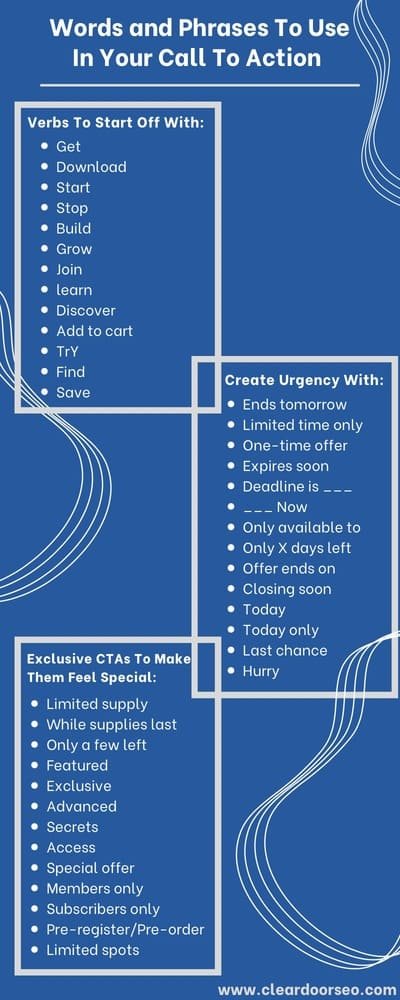
The Image to the left shows different types of words and phrases that you can use in your call to actions.
What are the Different Types of Call to Actions:
The different types of CTAs include: Sign-ups, subscribe, try for free, get started, learn more and join us.
While writing your website copy it is important to know which type of CTA button you should use. By employing the incorrect call to action button a website can drastically lower their click through rate, and ultimately their conversion rate.
Let’s have a look at the different types of call to actions:
1. Sign Up:
The reader can be invited to sign up for an online course, an event, a mailing list, or to test products and services. This CTA button copy is easy to understand and reduces friction points for readers as it is a simple process for them to sign up.
2. Subscribe:
A ‘subscribe CTA’ allows for a reader to get updates and information from the business in a non threatening way. This is because they don’t have to purchase anything or provide too much information to the business in order to increase their knowledge about the company or their content.
3. Try for free:
This button gets visitors excited and allows them to try a product or service with no commitment. This type of CTA can help a business generate interest in their products or services by offering a limited version to their audience. Moreover, it helps potential customers decide if they want to buy the product or not.
4. Get started:
A get started CTA is a generic call to action that is easy to understand. It can be paired with many types of call to action copy. However, it should be used only on occasion, as it is usually better to be more specific with CTA buttons
5. Learn more:
Lean more CTAs are a great way to give a potential customer an opportunity to gain more information regarding a certain topic. They are typically used when a website has limited space to expand on the entire subject.
6. Join us:
This type of call to action button allows site visitors to join an online community or group of like minded individuals to expand their knowledge on a certain topic. Additionally, it can be used to have a reader join an event you are conducting.
How to write a call to action?

There are many strategies to create an effective CTAs, but some of the commonly used ones are:
1. Good Design:
A good design is always pleasing to the eye and a good design helps to grab the user’s attention. A bright color that matches with the site’s color or an email is one of the easiest strategies that can be implemented right away!
2. High Visibility:
Since you want the user to complete a task, you want to ensure that your CTA is the most noticeable thing on the page. For example, the font size must be large enough to gain attention.
3. Defined Benefit:
Your CTA must define the benefit that the user will be getting from completing the transaction.
4. Actionable Call to Action:
As the name implies, your CTA must include actionable texts such as “learn more”, “buy now” or “download for free” which compels the user to take action.
5. Short and Sweet:
CTAs must be of short length and straight forward. A CTA shouldn’t be a phrase or a sentence. Your CTA must be between five to seven words.
6. Create Urgency:
Creating a strong sense of urgency such as “Limited Edition” or “Limited Time Offer” can compel users to take immediate action.
5 call to action examples
With call to actions it is important that we quickly build interest, provide ample information about the action we want visitors to take, and reduce friction points.
Let’s take a look at examples of call to actions that can provide some inspiration next time you are designing your CTA buttons.
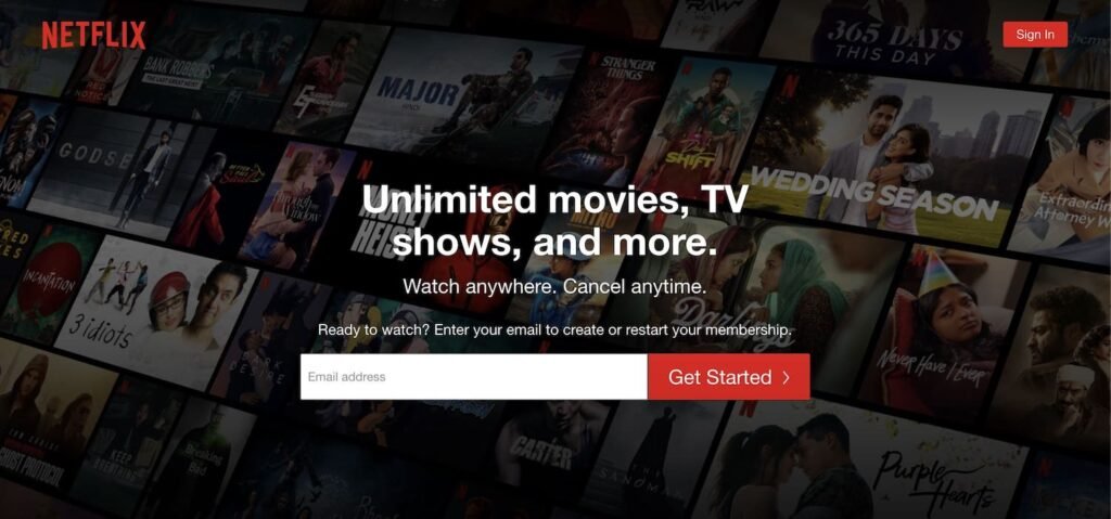
1. Get Started CTA: Netflix

The CTA Netflix uses is great. It is easy to complete and understand what the user needs to do. Additionally, they use a background full of some of their shows and movies that are the most talked about on social media and the internet.
This approach generates excitement while also reducing friction points for the user to sign up.
2. Learn More CTA: LifeStraw

LifeStraw uses a clear CTA for readers to learn more about the type of work they are doing and why they are doing it. Additionally, instead of using ‘read more’ which can be a major friction point for users, they use learn more instead. Using a copy like ‘learn more’ makes it seem like a more valuable and enjoyable action than going to ‘read more’, which usually means reading long text and more work for the reader.
3. Sign Up CTA: NBA Topshot

NBA Topshot brings life to their CTA by offering a demonstration of its platform. This helps induce excitement with their product and gets people to sign up. Additionally, their actual CTA to get people to sign up for the platform is easy to see and placed right under the demonstration. Overall, they do a good job combining different elements into their call to action button.
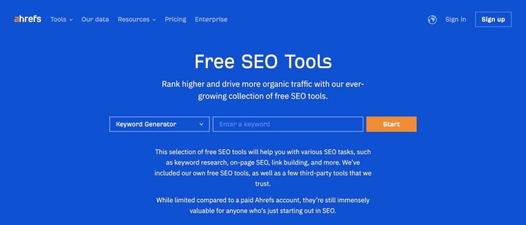
4. Try for free CTA: Ahrefs

Ahrefs try for free CTA is simple and straightforward. It tells the user what they will be getting and how to use the tool. It takes all fear and friction out of using their tools. By offering a limited version of their product, they do a great job of building a reputation around their brand, building backlinks to their site, and increasing their conversion rate.
5. Join Us CTA: Toms

Toms gives its users a chance to join their group of like minded people. The call to action uses an incentive of earning bonus points for joining their group. This CTA approach helps peak potential customers’ interest. As the reader will want to find out more about how to use the bonus points.
Takeaways: Call To Action (CTA)
Optimizing a site’s call to actions is essential to increase its click through rate as well as conversion rate. Conversions can lead to increased sales and traffic to your website.
You should include CTAs with a strong action verb throughout your website, as well as on blog posts. Remember to use multiple CTAs with specific language and not just ‘Click Here’ or ‘Find Out More’.
After designing and optimizing your CTA marketing efforts, ensure that you are conducting AB testing to monitor your campaign and efforts. By monitoring and testing your ad copy you can fully optimize your CTA buttons.
Finally, optimize your landing pages with CTAs to increase their conversion rate. If you find optimizing your pages and landing pages difficult, reach out to us with any of your questions. Or, you can utilize Clear Door SEO’s on-page SEO services to increase your website’s overall performance.
